Form Component
The Form component shipped with this package makes super simple to create a style form.
A FormGroup component is used to add the input form items with label. You can have label and the input arranged in a column or in a row.
Let's see a simple example where we have label and input in one column.
<Form class="w-1/2 mx-auto" @submit.prevent="submit">
<FormGroup
type="email"
label="Email"
:error="errorBag.email"
v-model="form.email"
/>
<FormGroup
type="password"
label="Password"
v-model="form.password"
:error="errorBag.password"
/>
<div> <Button type="primary"> Sign In</Button> </div>
</Form>
</template>
<script>
import {Form, FormGroup, Button} from '@adiranids/vue3-tailwind'
export default {
components: {Form, FormGroup, Button}
setup() {
const form = reactive({email: "", password: ""})
const errorBag = reactive({email: "", password: ""})
function submit() {
//submit form to the server by making api call
}
return {
form, errorBag, submit
}
}
}
</script>
The above code will produce the following output.
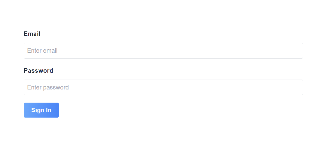
You will notice that without providing the placeholder, the inputs have placeholders of Enter {label}.
To put the label and input in one row, just set row prop of the FormGroup component to true, which is false by default.
<Form class="w-1/2 mx-auto" @submit.prevent="submit">
<FormGroup
type="email"
:row="true" <!-- row prop set to true -->
label="Email"
:error="errorBag.email"
v-model="form.email"
/>
<FormGroup
type="password"
label="Password"
v-model="form.password"
:error="errorBag.password"
/>
<div> <Button type="primary"> Sign In</Button> </div>
</Form>
</template>
<script>
import {Form, FormGroup, Button} from '@adiranids/vue3-tailwind'
export default {
components: {Form, FormGroup, Button}
setup() {
const form = reactive({email: "", password: ""})
const errorBag = reactive({email: "", password: ""})
function submit() {
//submit form to the server by making api call
}
return {
form, errorBag, submit
}
}
}
</script>
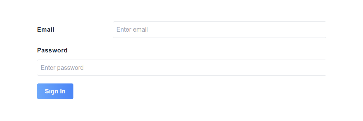
If you notice in the above example, the label Email and input type email are in one row because in the code we set the row prop to true for FormGroup component of Email.
The beauty of this FormGroup component is that it can also confirm the
value of two fields to be the same.
Let's take an example for Sign Up form where we want to check if password
and confirm password are matched.
<Form class="w-1/2 mx-auto" @submit.prevent="submit">
<FormGroup
type="email"
label="Email"
:error="errorBag.email"
v-model="form.email"
/>
<FormGroup
type="password"
label="Password"
v-model="form.password"
:error="errorBag.password"
/>
<FormGroup
type="password"
label="Confirm Password"
v-model="form.confirmpassword"
:confirm="true"
:confirmWith="form.password"
/>
<div> <Button type="primary"> Sign Up</Button> </div>
</Form>
</template>
<script>
import {Form, FormGroup, Button} from '@adiranids/vue3-tailwind'
export default {
components: {Form, FormGroup, Button}
setup() {
const form = reactive({email: "", password: "", confirmpassword: ""})
const errorBag = reactive({email: "", password: ""})
function submit() {
//submit form to the server by making api call
}
return {
form, errorBag, submit
}
}
}
</script>
Now an error message saying "Confirm password and password are not the same." will be displayed as long as confirm password field value is not equal to password field value.
In case if you need your own custom error message for password confirmation or any other field confirmation then just set the error prop of FormGroup component of confirm password or confirm field with string value.
Note: The confirm field validation just toggles the message and do not prevent the form from submitting. You need write your own validation code to avoid the form submit.
Here is the list of all the props that can be used with FormGroup Component
| Prop | Default Value | Description |
|---|---|---|
| row (type = boolean) | false |
If set to true then the label and the input are in one row on
|
| label (type = string) | "" | Label for the input field. |
| error (type = string) | "" | Error message for the input field. |
| inputClasses (type = string) | "" |
Space separated string of tailwind or css classes for styling the input element. |
| labelClasses (type = string) | "" |
Space separated string of tailwind or css classes for styling the label element. |
| type (type = string) | "text" |
HTML type for input tag. The allowed types are "text", "email",
"tel", "number", "password", "search", "otp", "radio", "checkbox", "url", "date", "color", "week", "datetime-local", "reset", "file", "month", "image", "time", "hidden", |
| placeholder (type = string) | Enter {label} | Placeholder for the input element. |
| confirm (type = boolean) | false |
If set to true then validates whether the value is same with the confirmWith prop value. Note: It only validates and displays the error message if the values are different. It does not prevent the form submission. |
| confirmWith (type = string) | "" |
Takes in the value to be confirmed with. Note: It only validates and displays the error message if the values are different. It does not prevent the form submission. |
| required (type = boolean) | false | required attribute value of input element. |