Button
The most basic usage of the button component is for some CTA.
import {Button} from '@adiranids/react-tailwind'
function App() {
return ( <Button> Click Me </Button> );
}
function App() {
return ( <Button> Click Me </Button> );
}
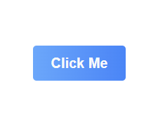
The above code will produce the result as shown in the image below.

By default the button is primary button (primary blue color). You can change this by changing the buttonType prop
Here are all the props and their values you can use for Button component
| Prop | Default Value | Description |
|---|---|---|
| buttonType (type = string) | primary |
Can have either of the value primary, warning, secondary, danger,
success, dark, light. <Button buttonType='success' @click='sendmessage'>Send Message</Button> |
| gradient (type = boolean) | true | If set to true, the background will be a gradient else single color. |
| gradientDirection (type = string) | r | Determines the background gradient direction. Available values are r,l,b,t refering to right, left, bottom, top respectively |
| pillShape (type = boolean) | false | If set to true then the button will be in a pill shape else normal shape. |
Here is an example with all the props in action
import {Button} from '@adiranids/react-tailwind'
function App() {
return ( <Button gradient={false} buttonType="warning" pillshape={true} onClick={showAlert} > Click Me </Button> );
}
function App() {
return ( <Button gradient={false} buttonType="warning" pillshape={true} onClick={showAlert} > Click Me </Button> );
}

Copyright © 2021 Adirani Digital Solutions Ltd