Table
This is one of the interesting components in this package. You can create a responsive table without having to worry about the padding and spacing between the cells. It is inspired from the Tailwind UI. There are two options available for the table theme, dark and light.
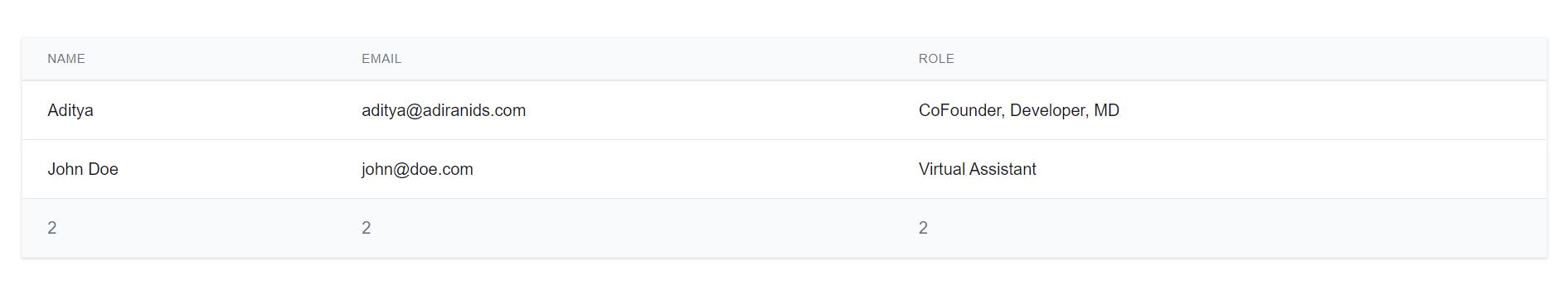
A basic example of light table is as below
const Head = () => {
return (<TR> <TH>Name</TH> <TH>Email</TH> <TH>Role</TH> </TR>) }
const Body = () => {
return (<>
<TR>
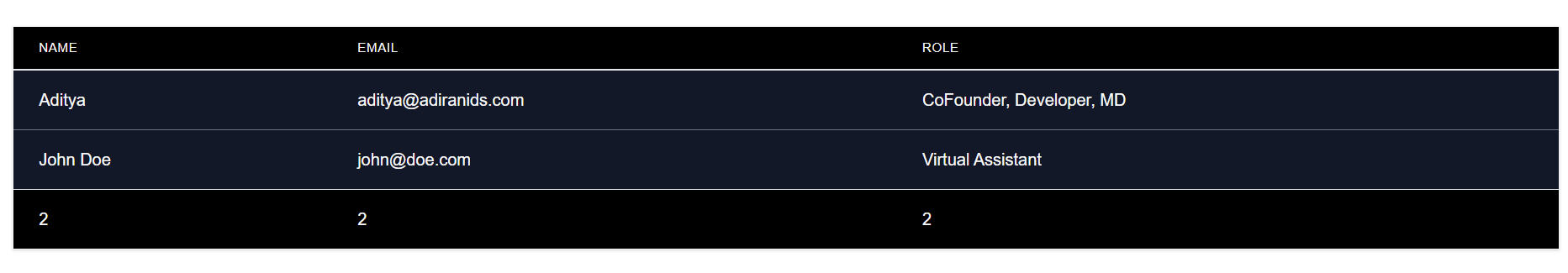
<TD>Aditya Kadam</TD> <TD>aditya@adiranids.com</TD> <TD>CoFounder, Developer, MD</TD>
</TR>
<TR>
<TD>John Doe</TD> <TD>john@doe.com</TD> <TD>Virtual Assistant</TD>
</TR>
</>) }
const Footer = () => {
return (<TR> <TD>2</TD> <TD>2</TD> <TD>2</TD> </TR>)
}
function App() {
return(<Table header={<Head />} body={<Body />} footer={<Footer />} />)
}
Notice the TH, TD and TR components in the above code, if they are used in lowercase then they will be treated as html tags and not as React components.
If you do not need the footer then just ignore the footer prop
You can also change the theme of the table to dark theme by setting the darkMode prop to true.
Here is the complete list of available props and their default values
| Prop | Default Value | Description |
|---|---|---|
| darkMode (type = bollean) | false | Changes the theme of the table to dark theme if set as true. <Table :darkMode='true'>...</Table> |
| bordered (type = boolean) | true | If set to true, draws the outer border to the table. color. |
| header (type = ReactNode) | required | Header section of the table |
| body (type = ReactNode) | required | Body section of the table |
| footer (type = ReactNode) | required | Footer section of the table |